VA Loma Linda Healthcare System
Creative established a multi-point strategy that simplified VA Loma Linda’s unnecessarily complex wayfinding system and improved patient experience.
Loma Linda, CA
Simplifying Navigation at Jerry L. Pettis
Memorial Veterans Hospital
Prior to working with Creative, VA Loma Linda had an unnecessarily complex wayfinding system that provided little help to patients and visitors attempting to navigate the maze of similar looking corridors. The previous system was comprised of several layers of complexity with many zones, colors, and codes for patients to decipher along their journey. Adding further complexity, directional signs had long lists of departments and were difficult to update. Upon analysis, Creative established a multi-point strategy that simplified navigation and improved patient experience.
Services:
- Wayfinding Masterplan & Implementation
- Room Identification, Directional, and Life Safety Signage
- Patient Information & Contact Precaution Signage
- CLC Neighborhood Theming
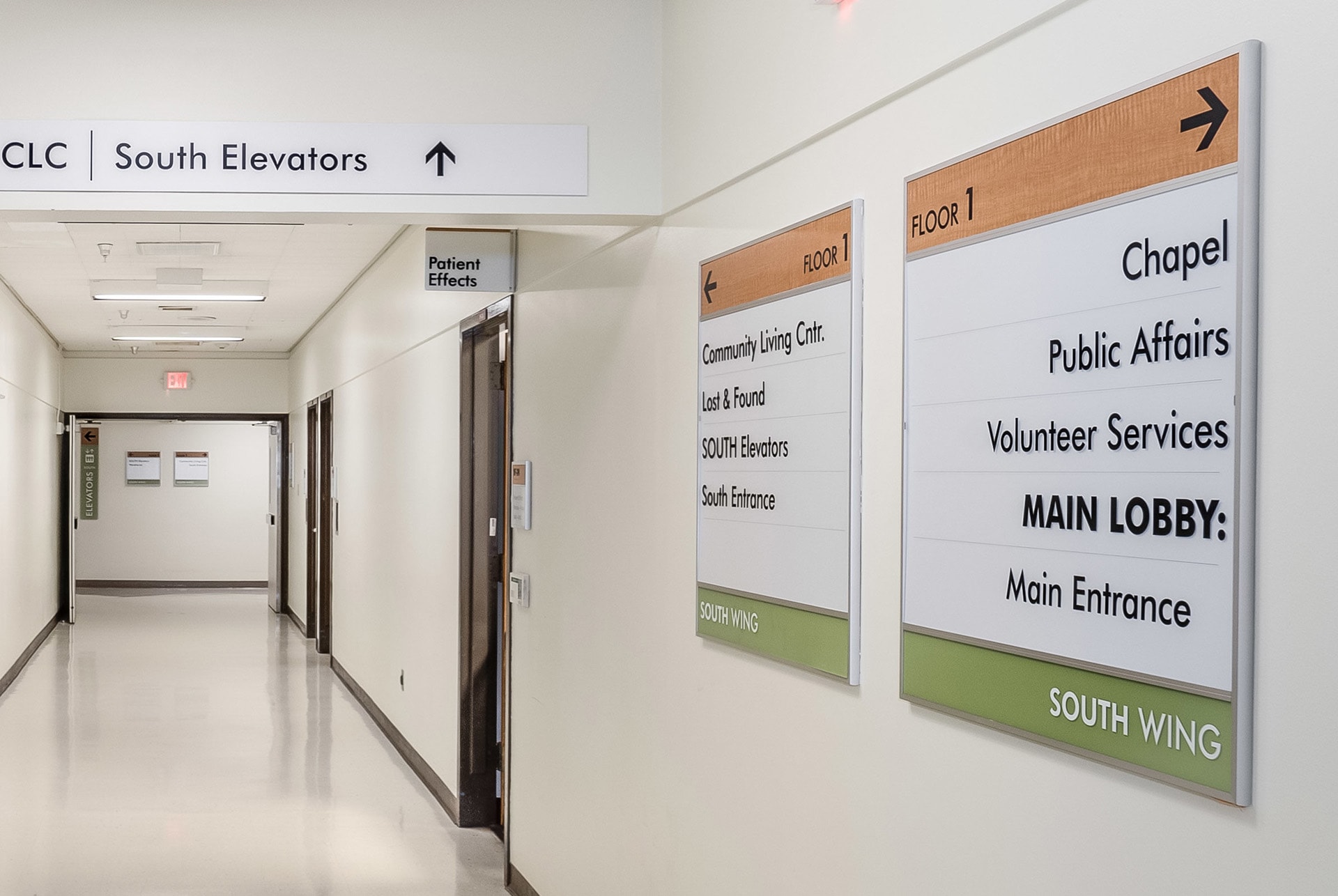
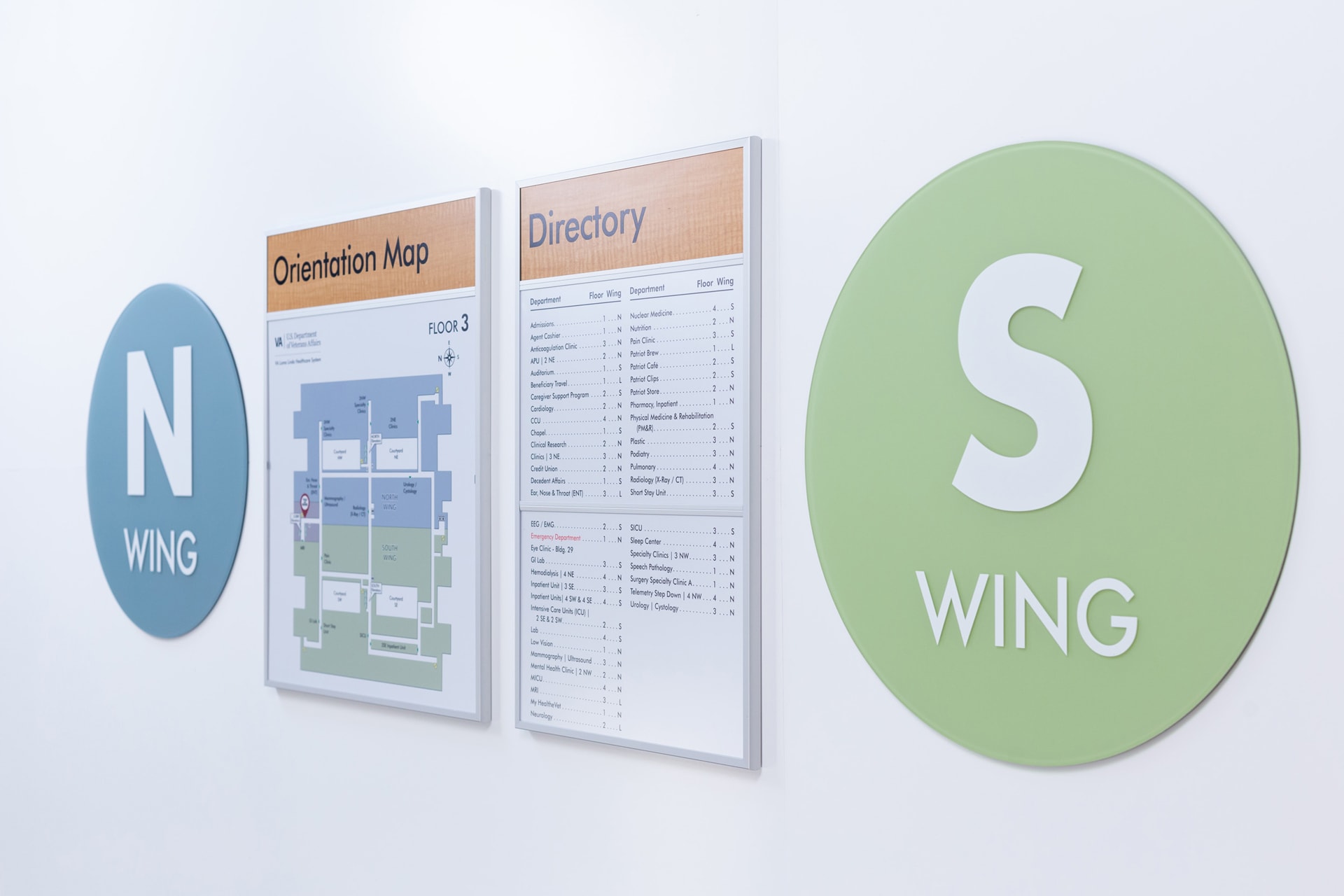
Establish North and South Wings: to improve spatial orientation for patients & visitors. Clearly branding North and South wings gives patients a high-level understanding of where they are in relation to the entrance, primary corridor or elevator lobby they started from.

Define 3 Primary Elevator Lobbies: as "North" and "South" corresponding with each wing, and "Lobby" elevators located nearest to the main entrance lobby.
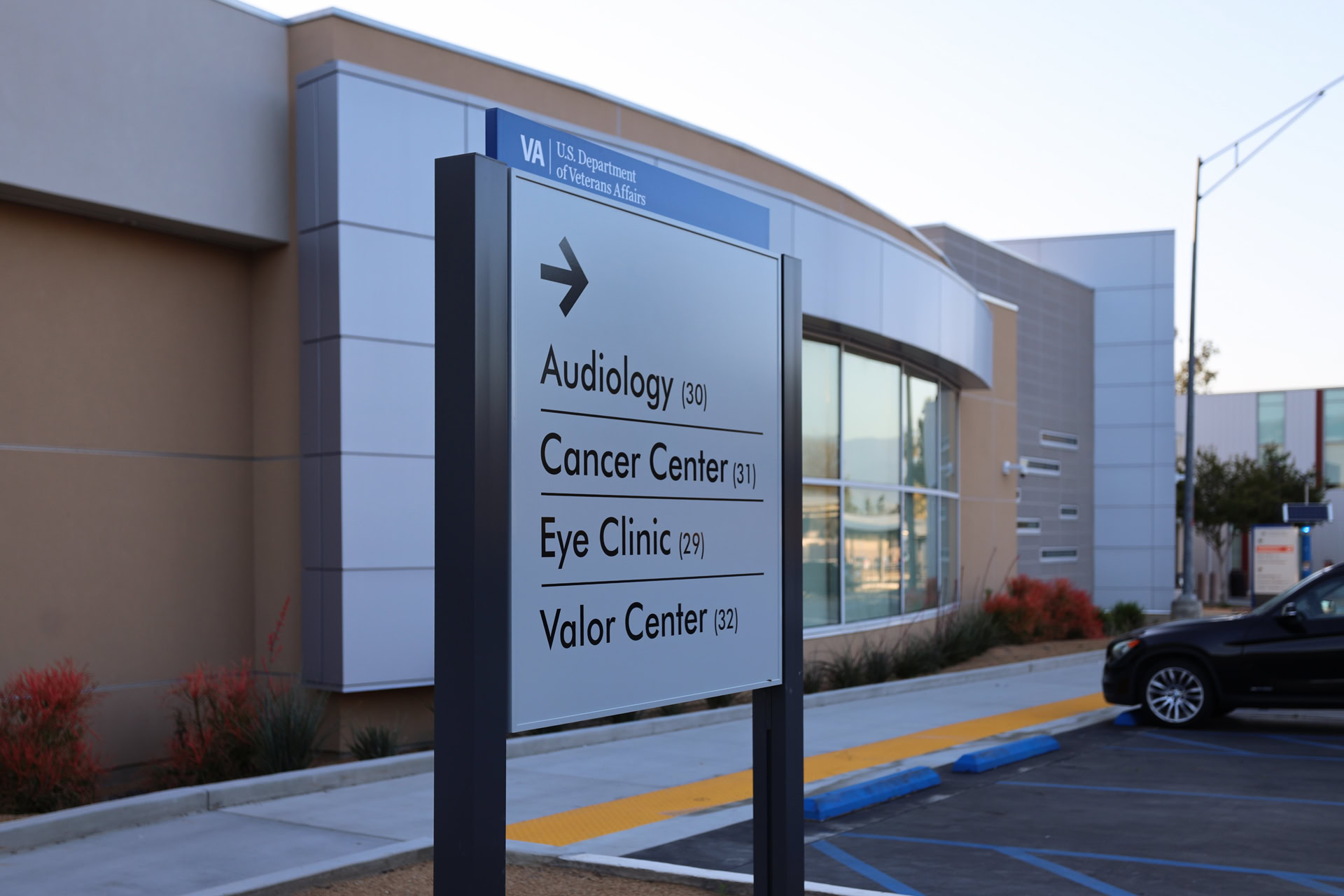
Reduce Visual Clutter: by limiting long lists on directional signs at primary decision points. Focusing on high-level information and destinations helps to reduce decision fatigue and move patients forward to the next decision point.

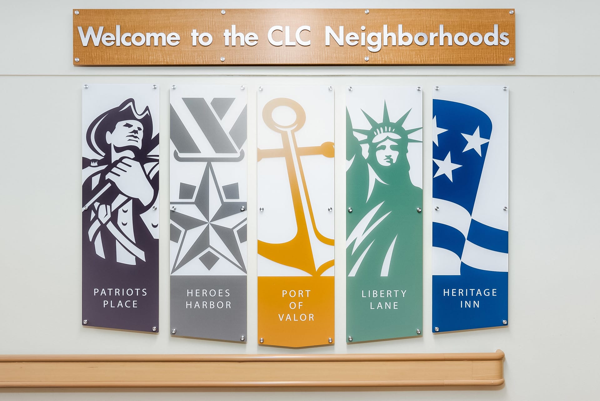
Create CLC Neighborhood Themes: to welcome and orient visitors and residents. A custom "Welcome" wall introduces the 5 themes which are then reinforced with colors and icons on signage within each neighborhood.

Utilize Patient Information & Precautions Signs: in the ICU, inpatient rooms, and Community Living Center. CareTabs signs display patient information notifications with added Contact Precaution Tabs for detailed safeguards.


