Togus VA Medical Center
Campus-wide wayfinding overhaul, artwork, and exhibits at America’s first VA hospital.
Augusta, ME
Campus-Wide Wayfinding Overhaul
at America's First VA Hospital
Download PDF
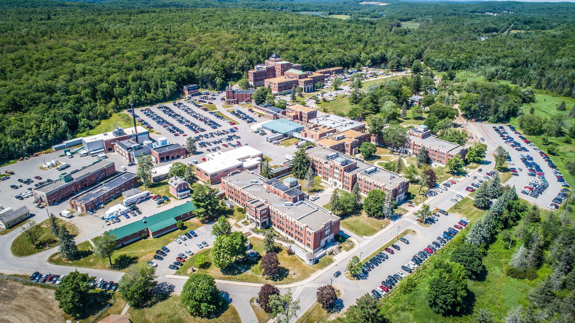
Dating from 1866, Togus VA Medical Center is the oldest operating facility in the VA network. The campus spans over 500 acres with over 40 buildings. This aging, historic facility is continuously undergoing renovation and construction projects that have impacted wayfinding campus-wide. The main hospital building is connected to 15 outlying buildings by a long serpentine corridor system consistently leaving patients and visitors feeling lost. Creative was brought on to completely overhaul interior and exterior wayfinding signage as well as create a welcoming experience with artwork and exhibit graphics.
Services:
- Interior & Exterior Wayfinding
- Corridor Branding
- Historical and Inspirational Feature Walls and Exhibits
- Art Programming
Campus Wayfinding Signs: Long, wooded entry roads leading to multiple parking lots and buildings across the campus required a clear information hierarchy and high-visibility signage.

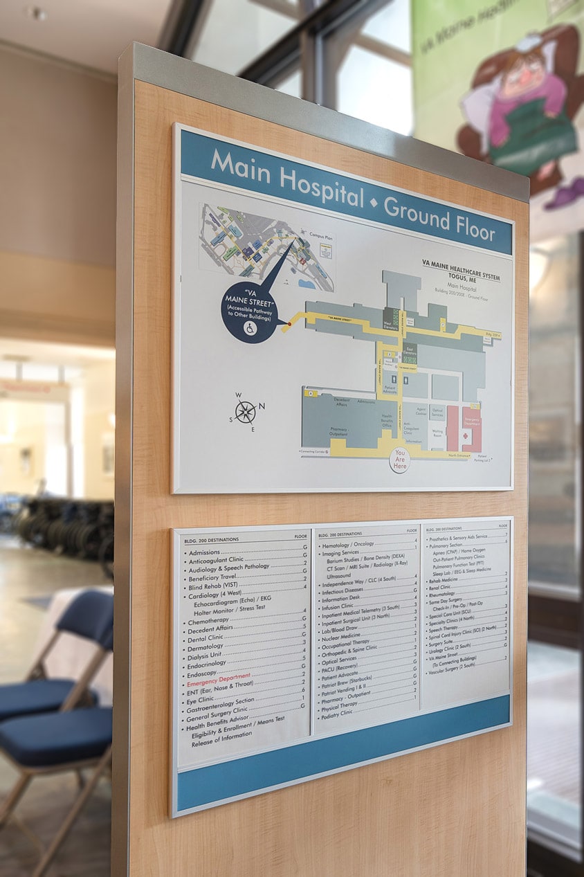
Uniformed Interior Sign System: A signage standard was developed for VA Togus that can be shared amongst stakeholders, management, and leadership to ensure a consistent system design for reorders and future projects throughout the entire facility.

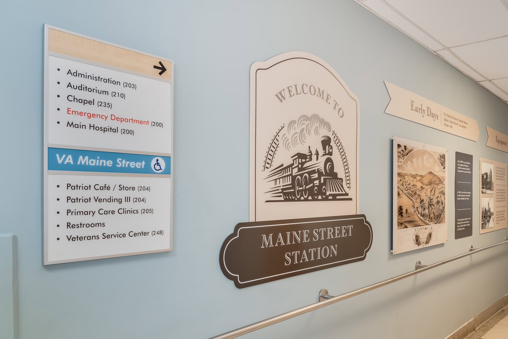
Branded Accessible Pathway: The winding, connecting corridor was confusing for veterans to navigate. Branding this path as “VA Maine Street”, highlighted consistently on signage, provides a sense of continuity to the journey culminating at “Maine Street Station”, a reference to the historic Kennebec Central Railroad.
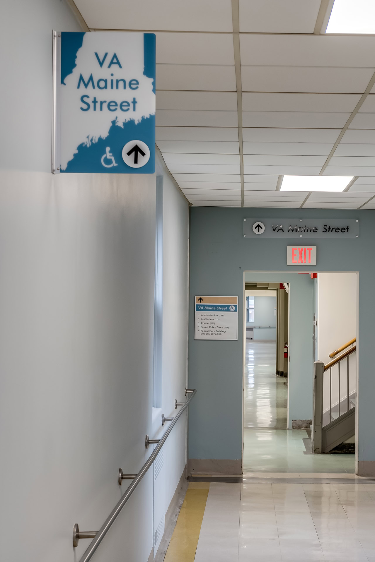
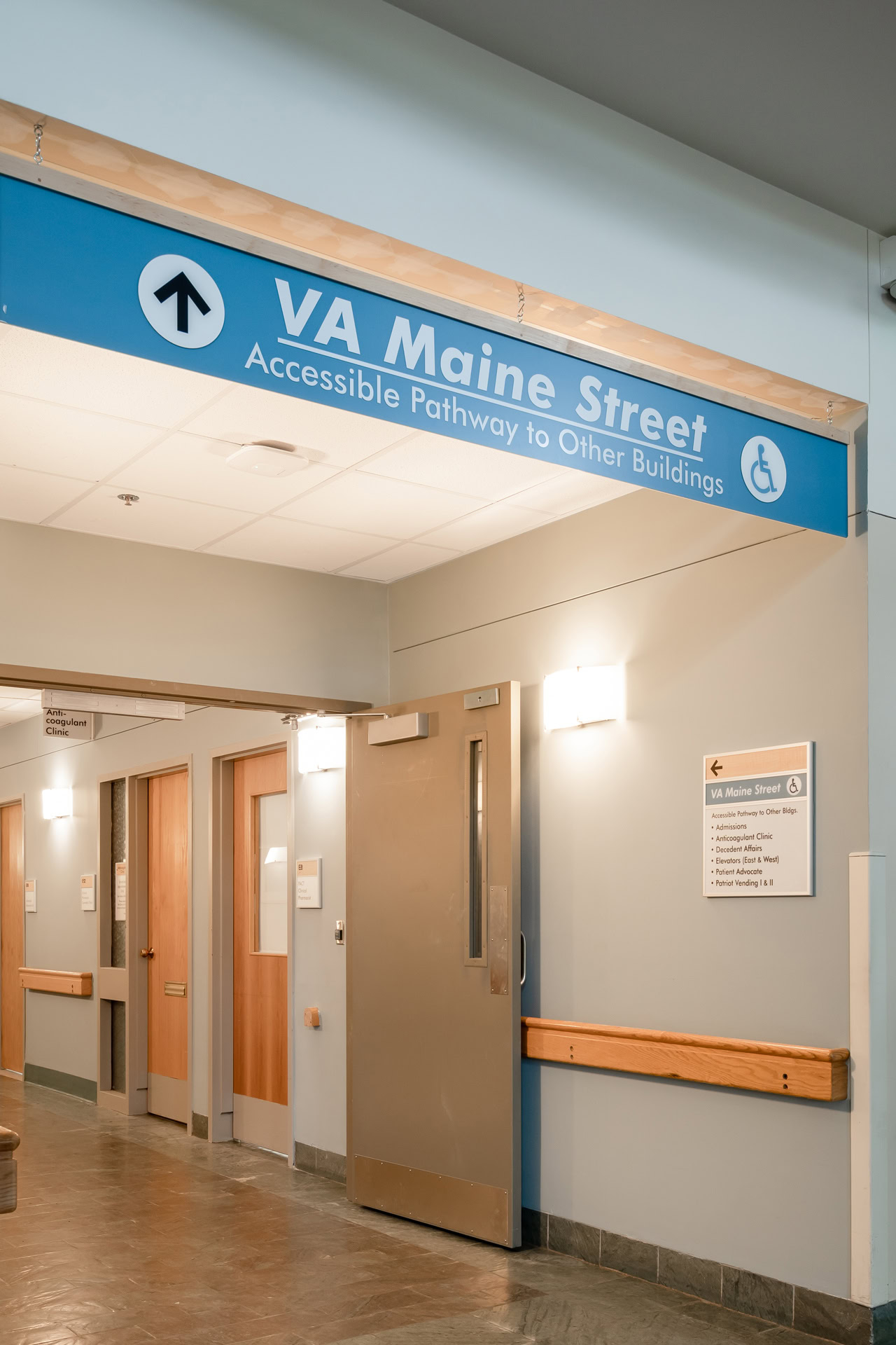
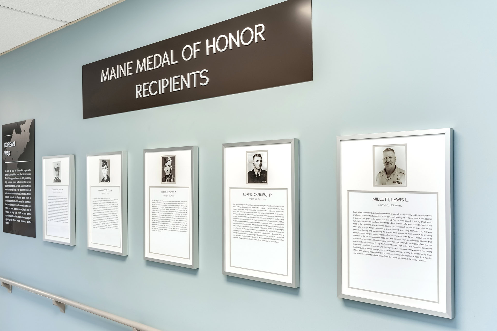
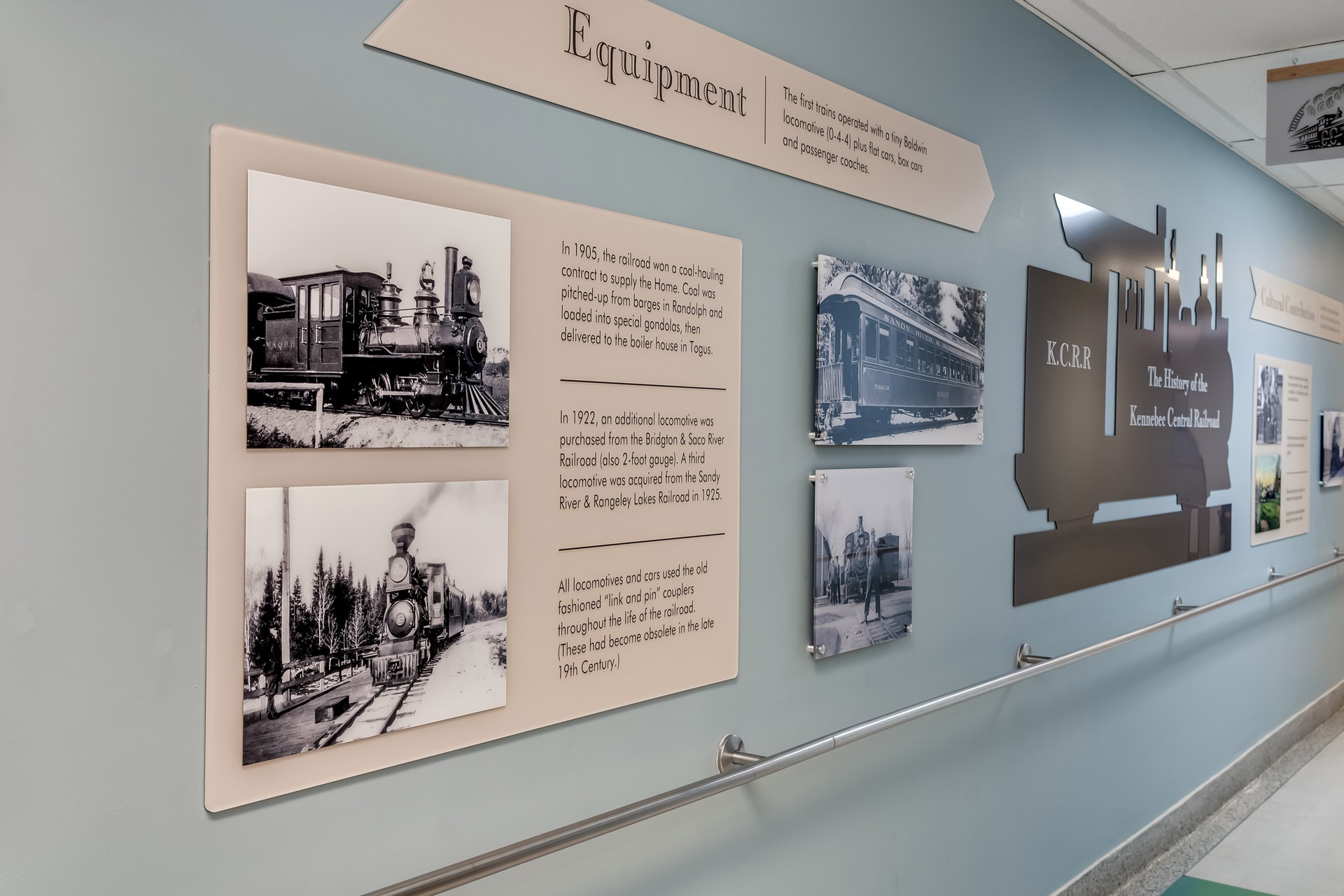
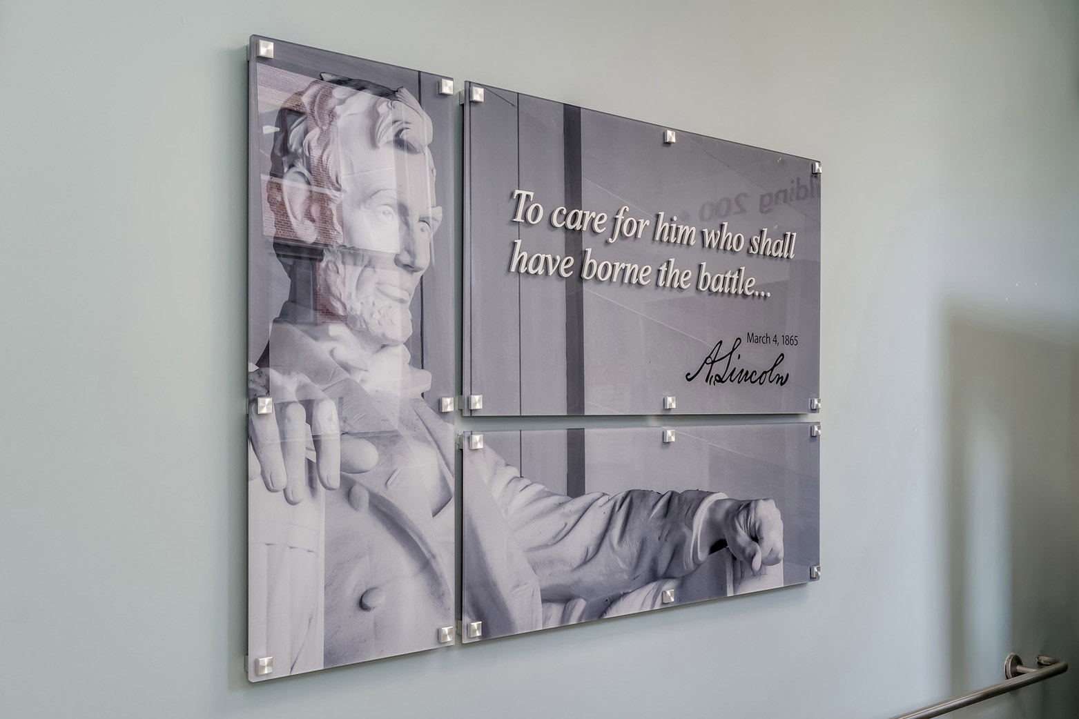
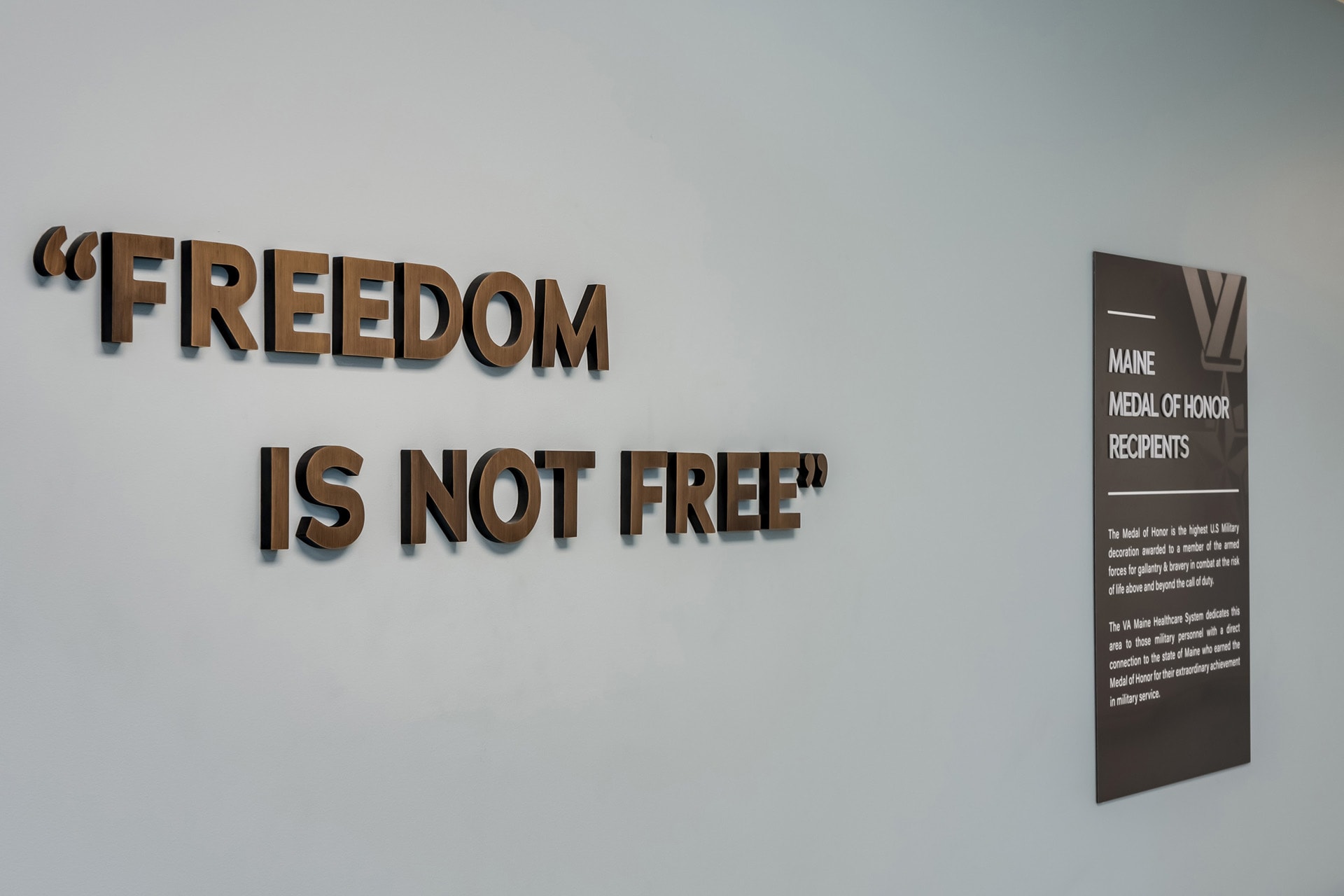
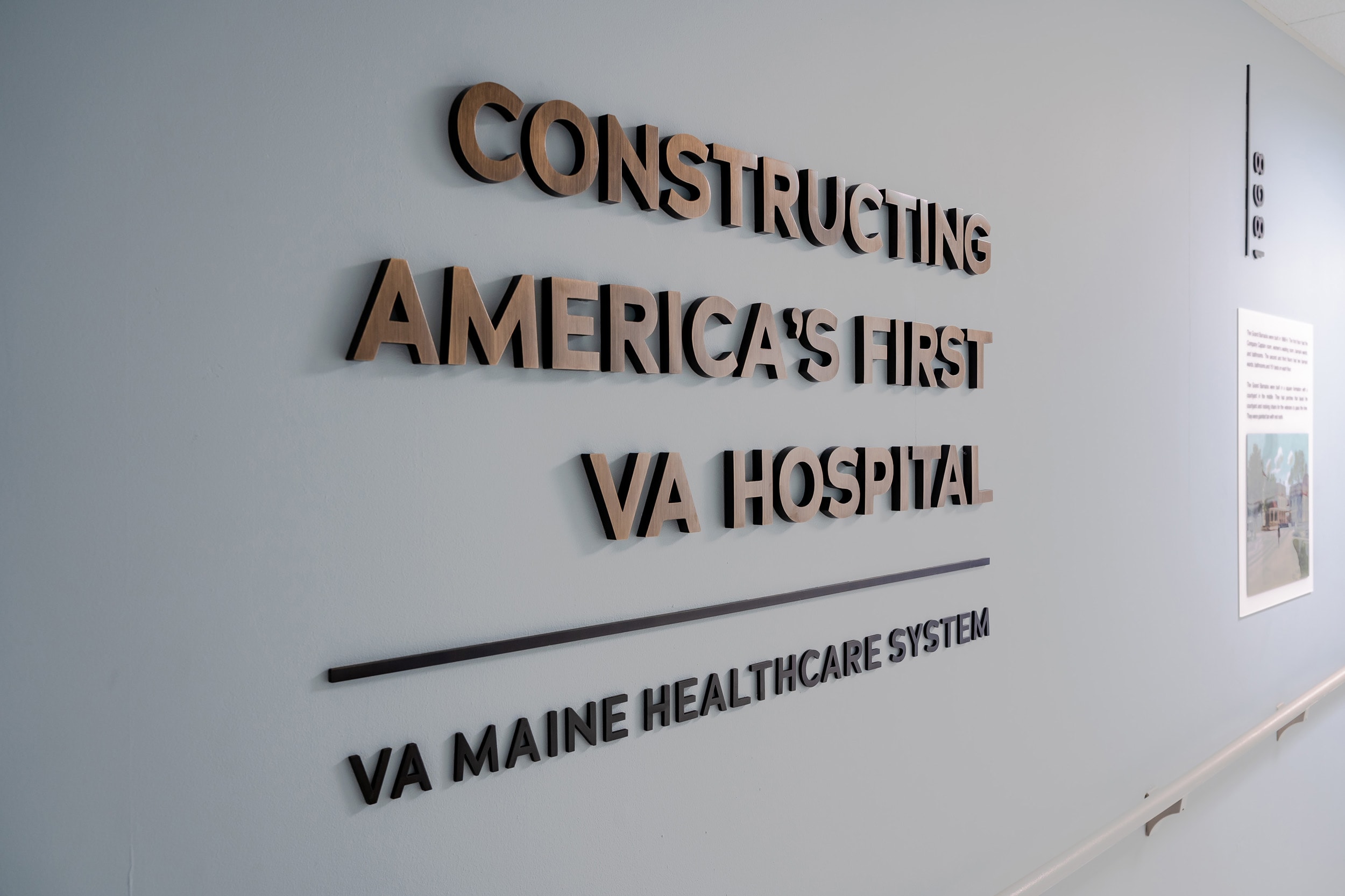
Feature Wall Exhibits: The connecting corridor’s long stretches of empty walls contributed to it’s maze-like experience. Adding inspirational and informative exhibits along the path creates memorable landmarks as well as institutional pride. The list of exhibits includes a timeline history of the facility, medal of honor recipients, military branch graphics, and history of the Kennebec Central Railroad.

Art Program Themes: To further orient patients and visitors and reinforce a sense-of-place, art themes were curated for each level of the main building. Imagery of Maine was used for the ground floor while local flora, fauna, and environments were used for floors 1 through 7.


