Central Alabama Veterans Health Care System
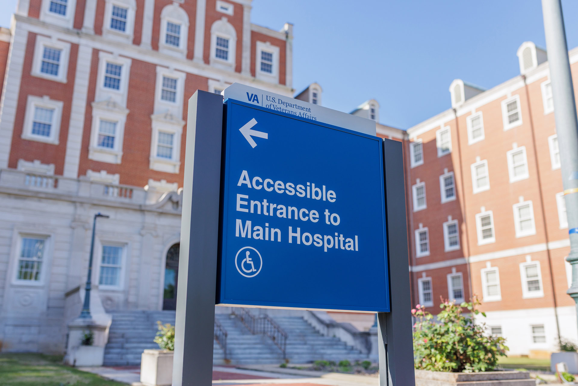
One System. Two Wayfinding Strategies.
Central Alabama Veterans Health Care System serves nearly 50,000 Veterans across central Alabama and western Georgia, with approximately 433,000 outpatient visits annually. Its historic medical centers in Montgomery and Tuskegee present distinct layouts and circulation challenges.
Creative Sign Systems implemented a comprehensive interior and exterior wayfinding program for both campuses, combining consistent design standards with strategies tailored to each location. The approach addresses how patients arrive, find appropriate entrances, and move through the facilities, creating a coordinated wayfinding experience across two very different environments.
Arrival Experience
Consolidating core buildings and directing patients to the Main Entrance
Effective arrival wayfinding establishes a clear path from campus entry to parking and the appropriate entrance. Each facility’s layout calls for a different approach.
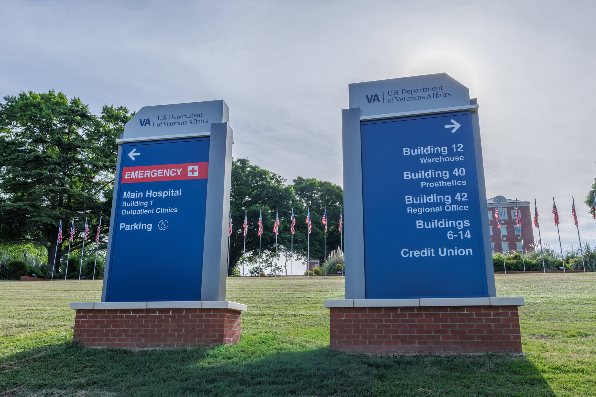
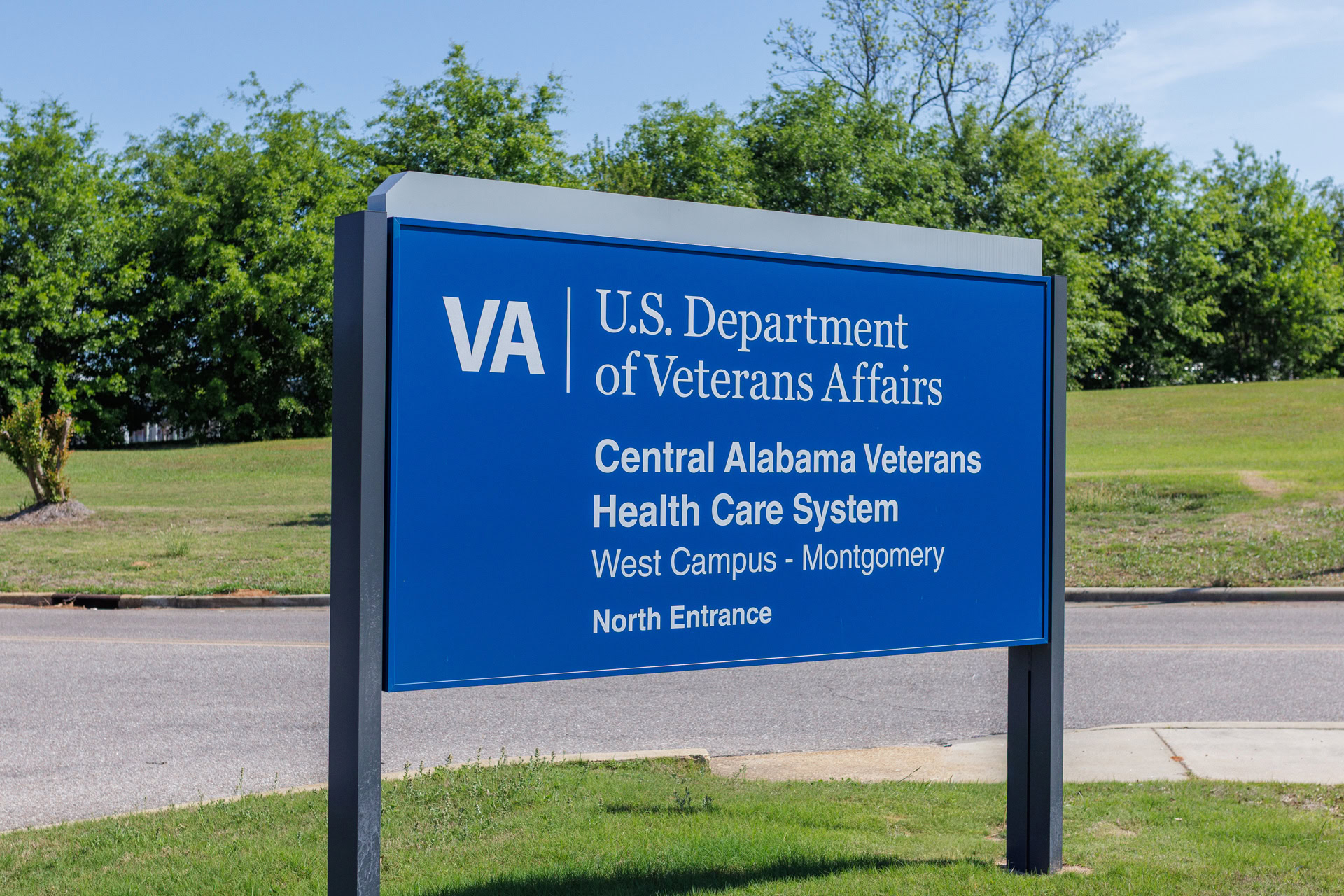
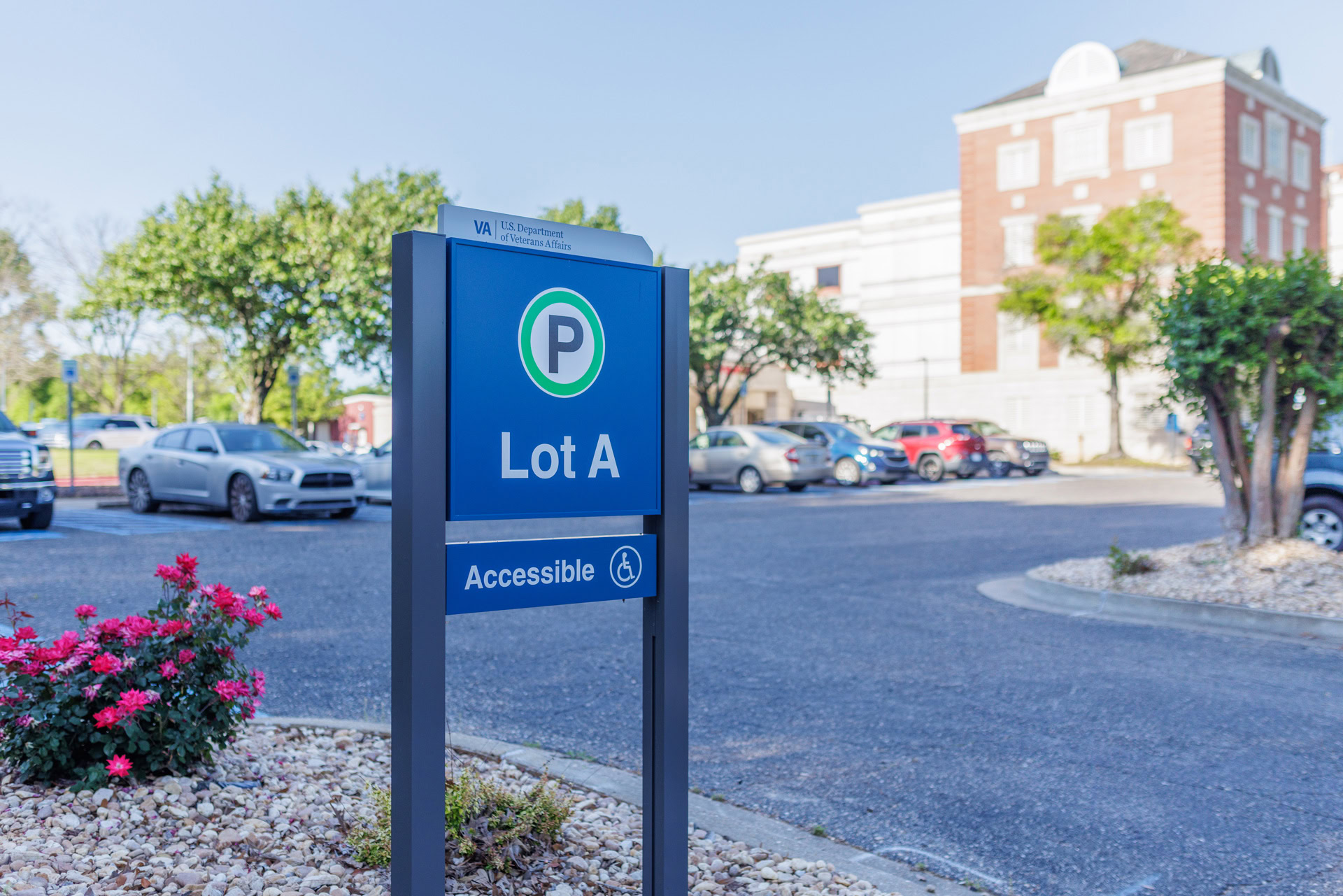
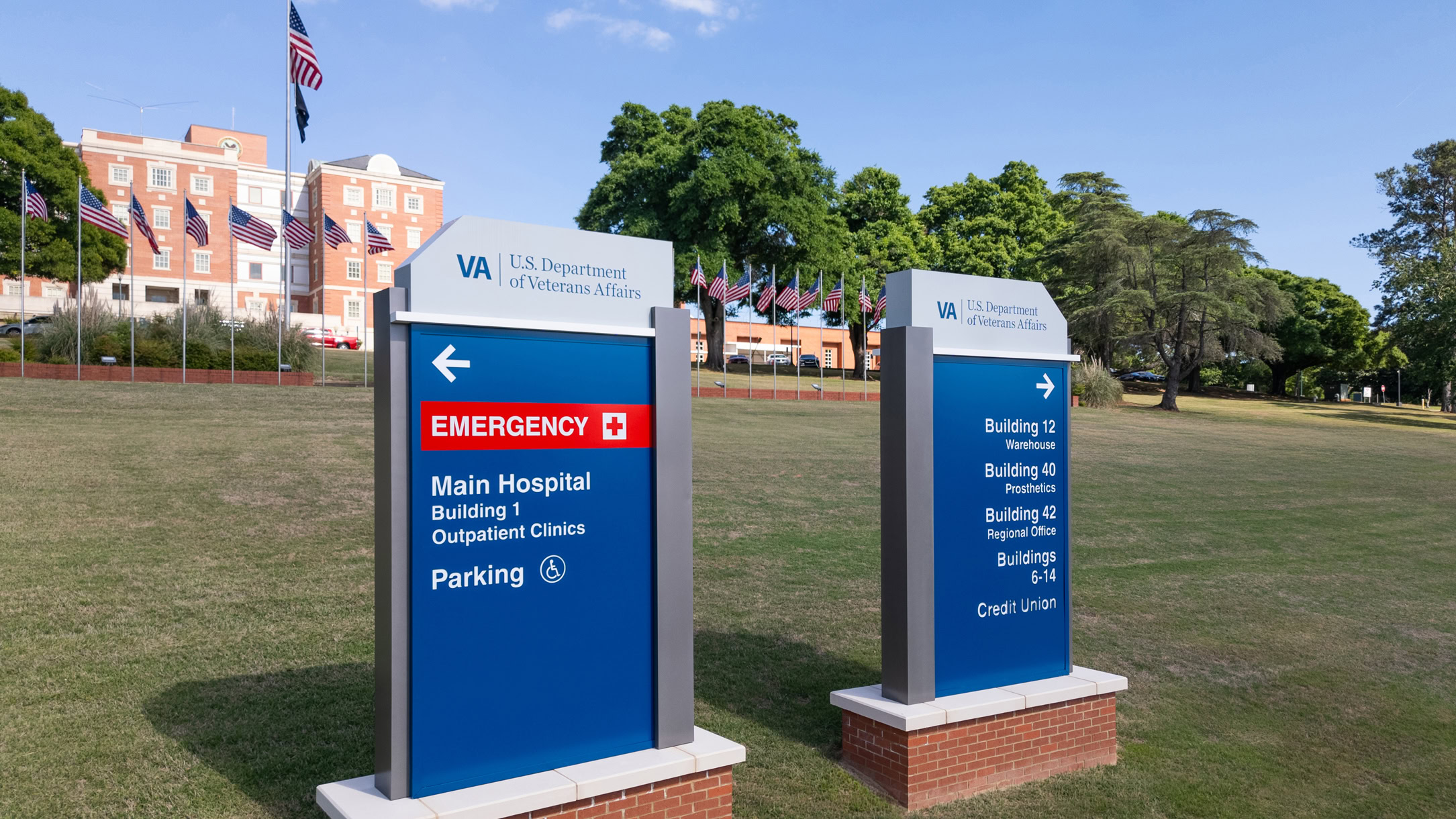
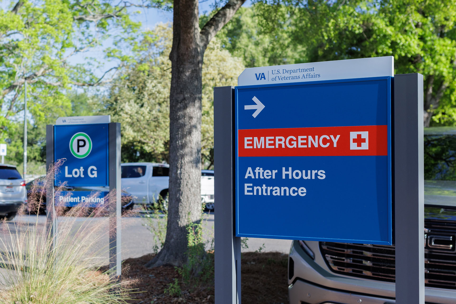
Montgomery: A relatively simple loop road concentrates key decisions near two primary vehicular entrances. Signage directs patients to parking and the Main and Emergency entrances.
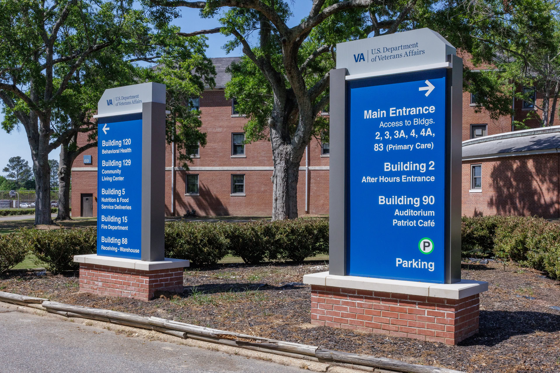
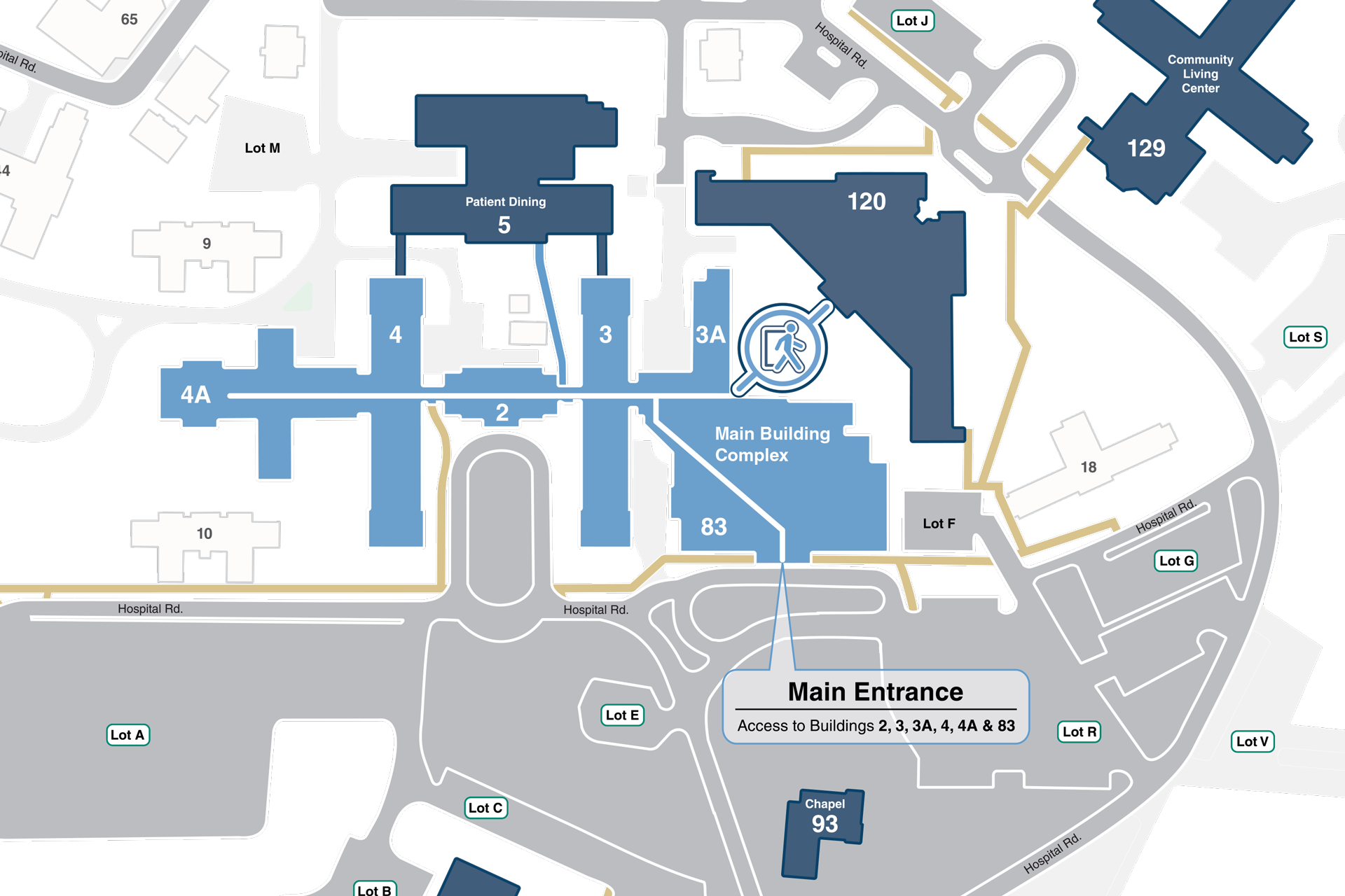
Tuskegee: Long approach roads, dispersed parking, and numerous interconnected buildings required a more comprehensive strategy. Previously treated as individual destinations, the core buildings were grouped under a single wayfinding designation, the Main Building Complex, with signage directing patients to a shared Main Entrance.
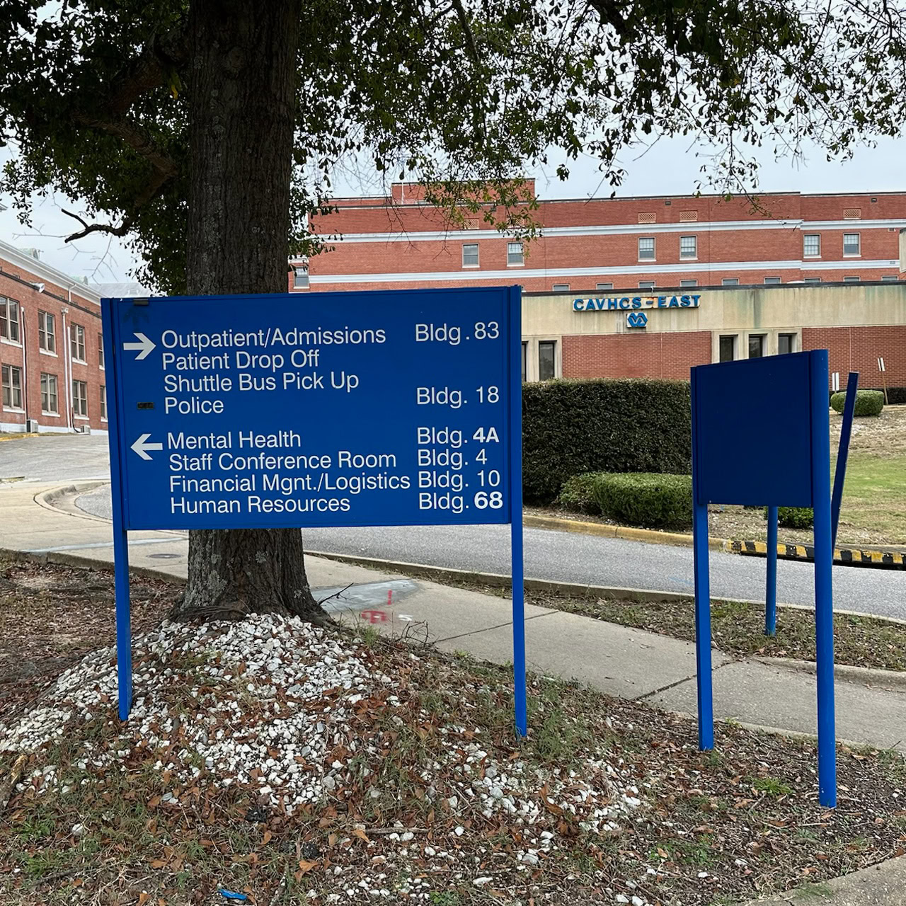
Before
Dense destination lists and building numbers made it difficult to identify appropriate patient entrances.
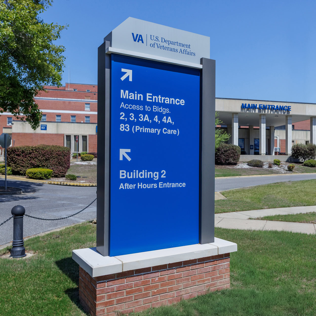
After
Simplified messaging directs patients to the Main Entrance, providing access to the interconnected buildings of the Main Building Complex.
Pathways to Care
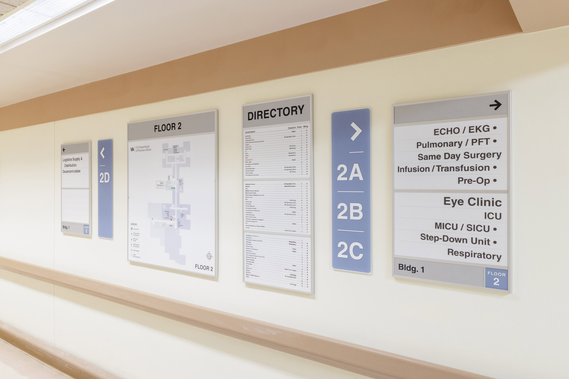
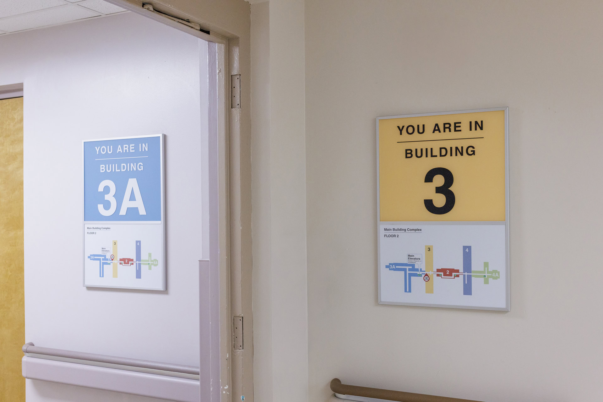
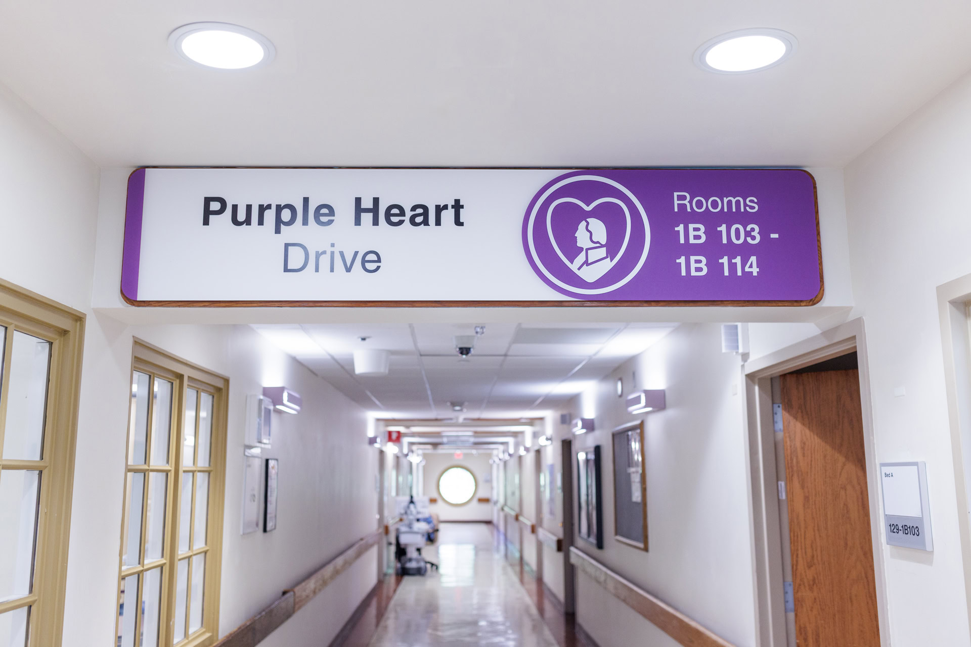
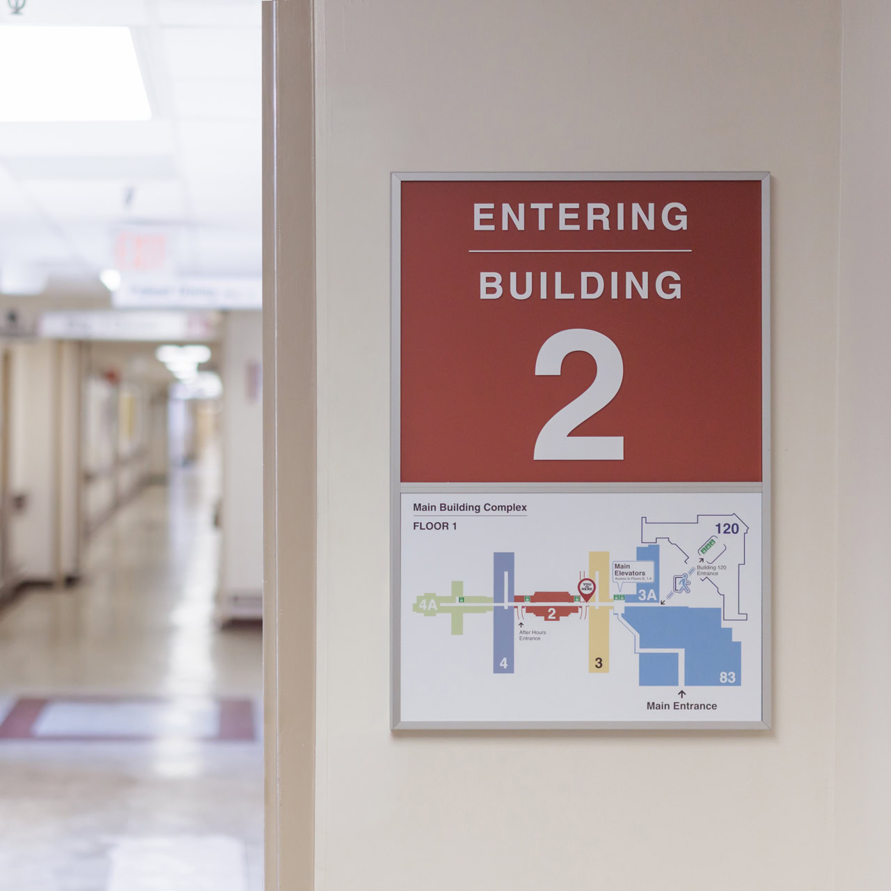
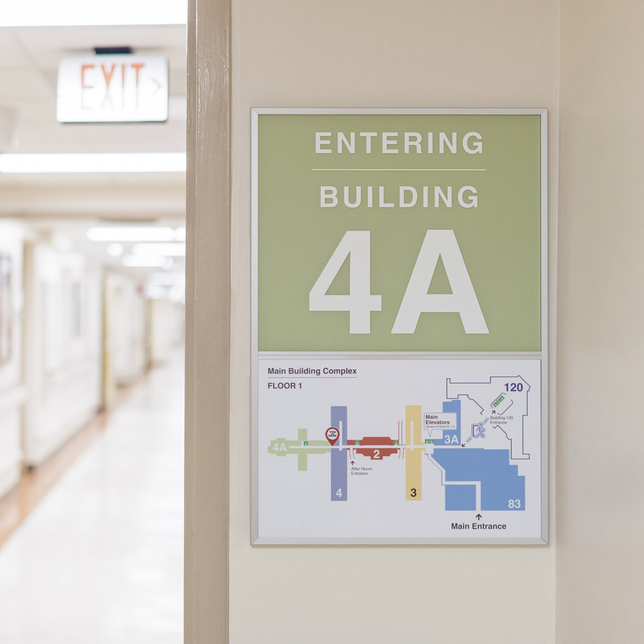
At both campuses, architecture alone offered few cues for orientation. Color was used to make these distinctions clearer, with each facility using a different sequence to guide patients from entrance to destination.
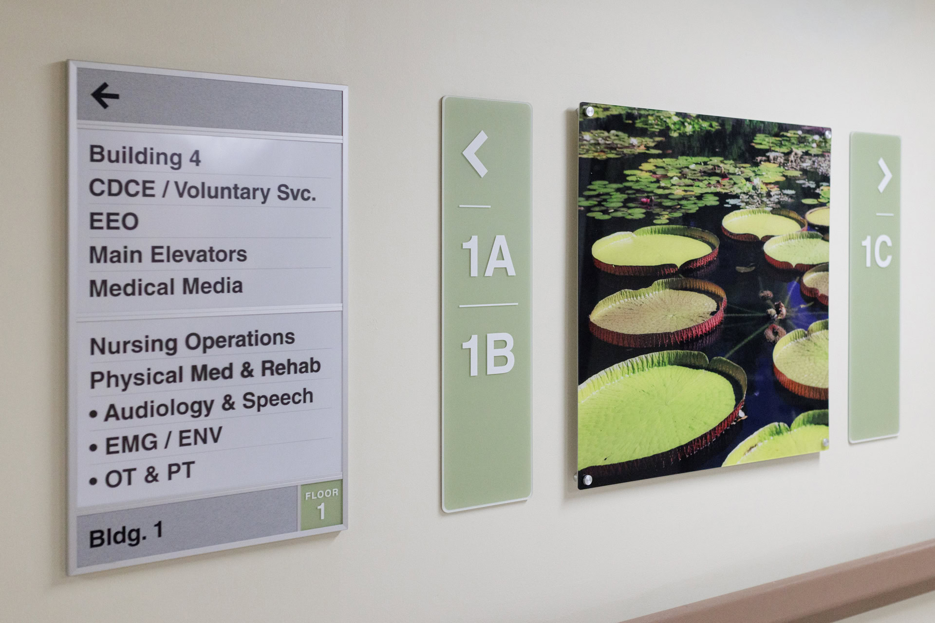
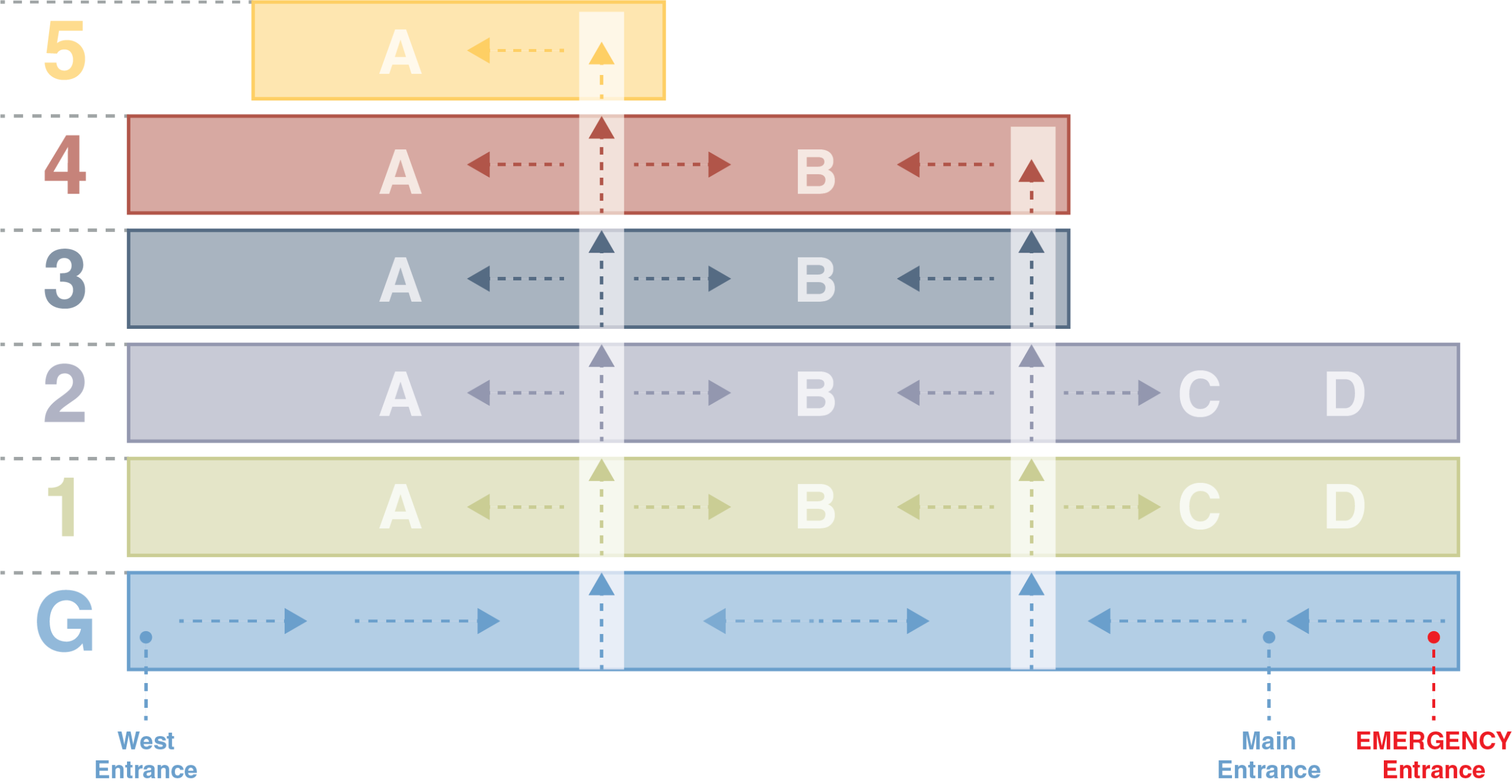
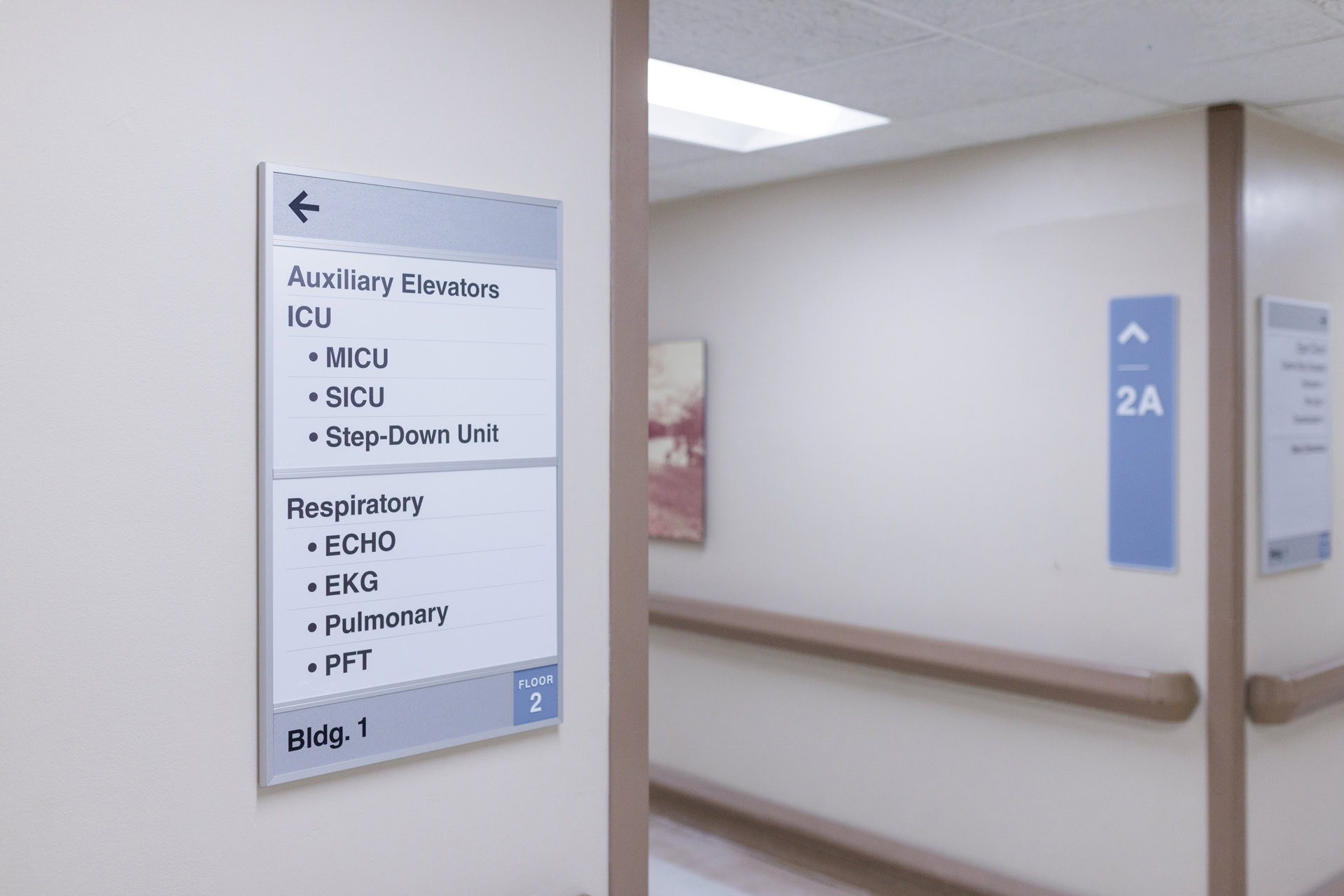
Montgomery: A winding ground-floor corridor connects three primary entrances with key destinations and two main elevator banks. The upper floors share similar layouts, so wings are identified by both color and letter, helping patients navigate first to the correct floor, then to the appropriate wing and destination.
One System. Built for Change.
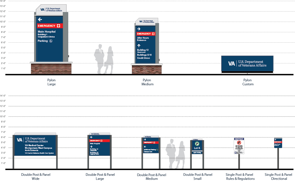
Across Montgomery and Tuskegee, a unified family of interior and exterior signage components establishes a consistent visual language while accommodating the distinct needs of each campus.
Standardized sign types, materials, and construction methods simplify maintenance and replacement, reduce long-term costs, and support efficient updates. This coordinated approach also makes it easier to extend the system as campuses and services evolve.
More Than a Cosmetic Upgrade
Replacing outdated signs may improve appearances, but it won’t correct confusing routes, inconsistent information, or poorly placed directions. Without addressing these underlying issues, a cosmetic upgrade risks preserving the same problems at considerable expense. Every Veterans Affairs campus presents unique wayfinding challenges, shaped by its architecture, circulation patterns, check-in points, and operational procedures.
Effective wayfinding begins with understanding how people actually use a facility. Creative Sign Systems brings that perspective to each project, evaluating circulation patterns, destination relationships, and facility-specific challenges to develop solutions that address more than appearances.